
Kashier Merchant Dashboard
Overview
A three-phase redesign of Kashier's merchant dashboard, from a data-dense analytics console through a wholesale visual rebuild, to a systematic new template with two variants for how new merchants experience the onboarding zone.
Kashier's merchant dashboard is the operational centre for thousands of Egyptian businesses, where they track revenue, manage payouts, monitor balances, and reach every product the platform offers. Getting it right required three distinct design phases, each responding to what the previous one left unresolved.
Phase 1, The Original Dashboard
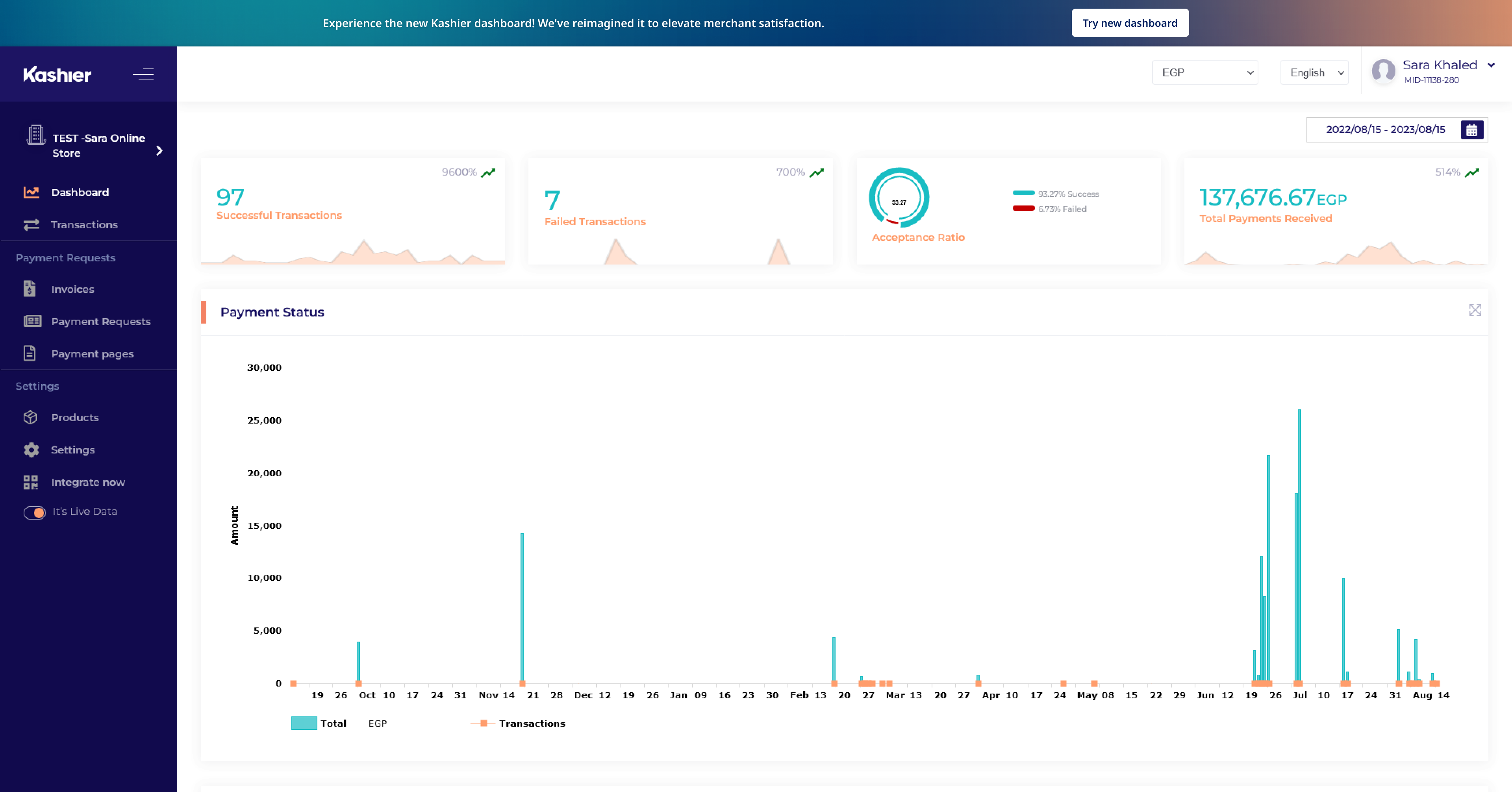
The original dashboard was built around financial analytics. Four KPI tiles sat at the top, successful transactions, failed transactions, acceptance ratio, and total payments received, followed by a full-width bar chart. The sidebar used Kashier's dark navy palette and a dense navigation structure that reflected how the product had grown: feature by feature, without a coherent grouping strategy.
It worked for established, activated merchants. It didn't work for new ones. And it had no room to absorb the expanding product surface Kashier was building toward.
Phase 2, The Light Redesign
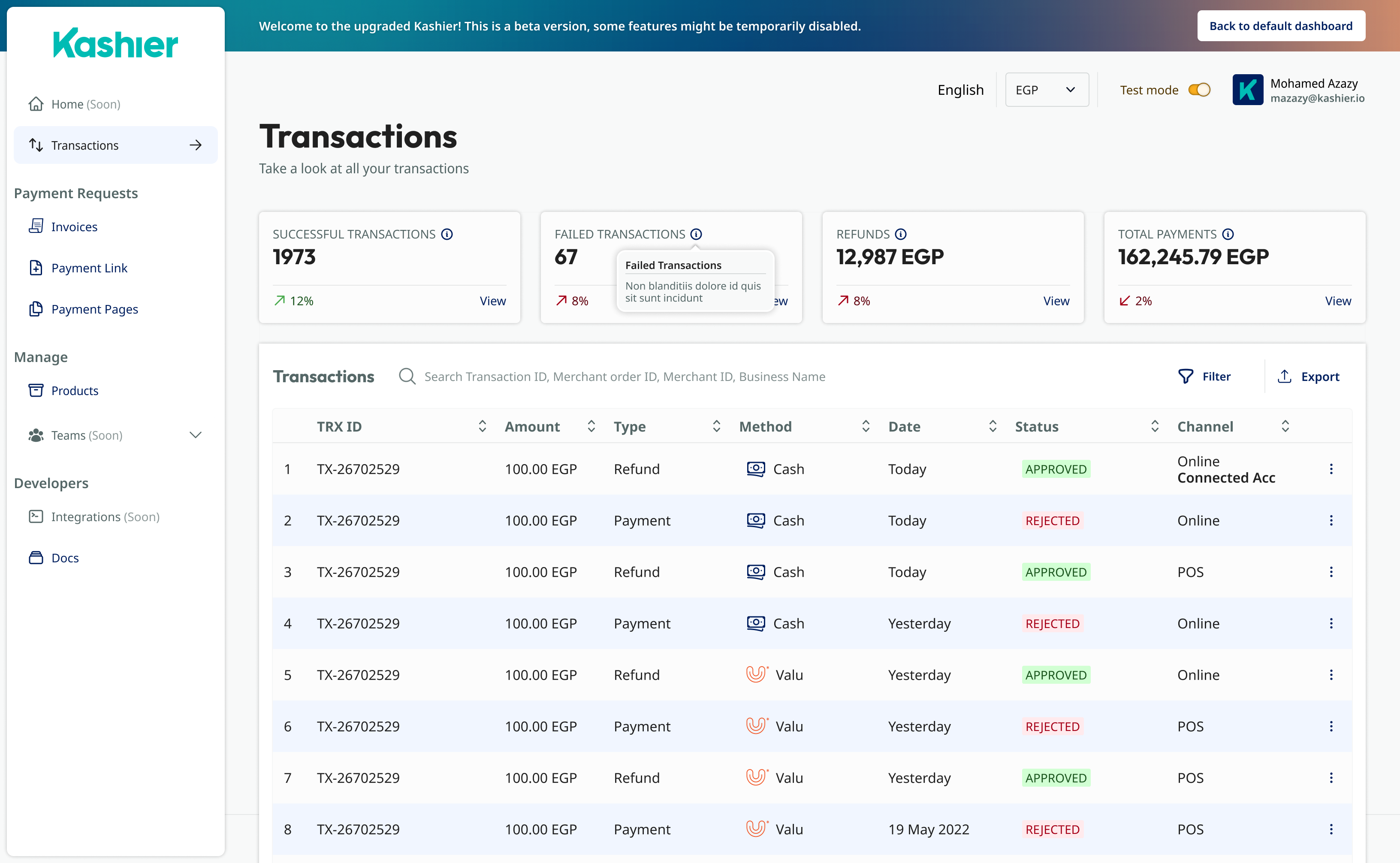
Phase 2 was a full visual rebuild. Dark chrome gave way to a white sidebar and light surfaces. Typography tightened. Navigation was reorganised into named groups, Payment Requests, Manage, Developers, with a cleaner hierarchy. Transaction data moved from a chart to a sortable table with column-level filtering and export.
This shipped as a beta running alongside the original, with a banner inviting merchants to try it and a link back to the old dashboard. It moved things forward, but the onboarding gap for unactivated accounts remained unaddressed. And the layout still wasn't modular enough to absorb new features without manual adjustment.
Phase 3, The New Template
Phase 3 didn't attempt another visual overhaul. It focused on two structural problems that had persisted across both previous versions: the rigidity of the home screen layout, and the broken experience for new merchants who arrived before completing account setup.
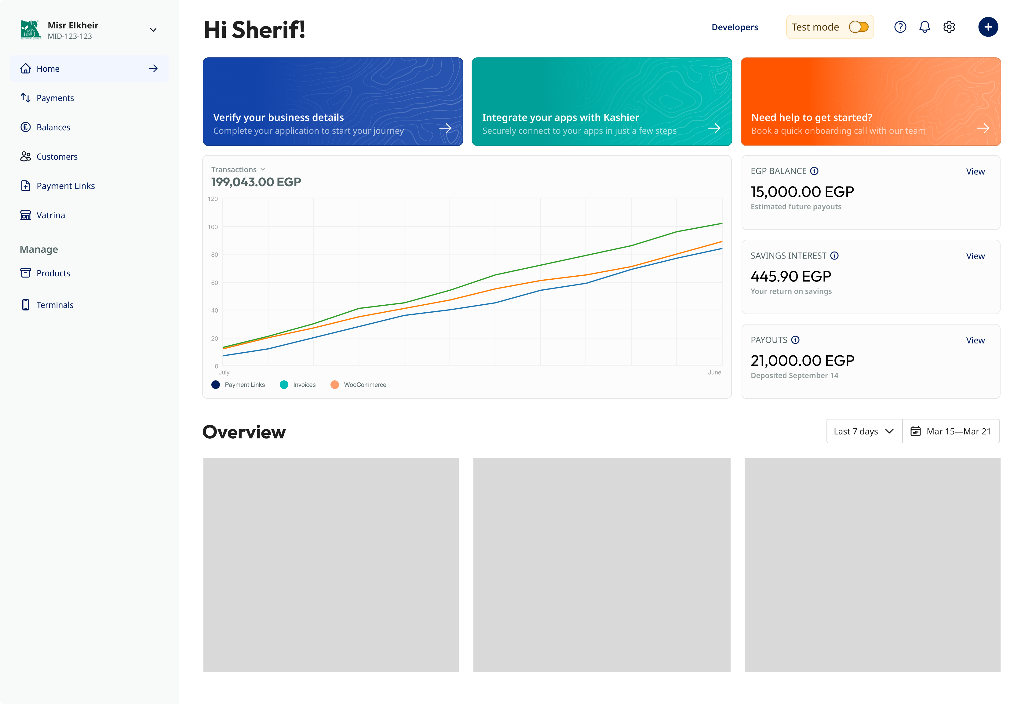
The result was a more organised template, a systematic KPI column, logical navigation grouping, and a conditional onboarding zone that appears only when setup is incomplete. Within that template, two variants were explored for how the onboarding zone itself should work.
Variant A, Alert Approach
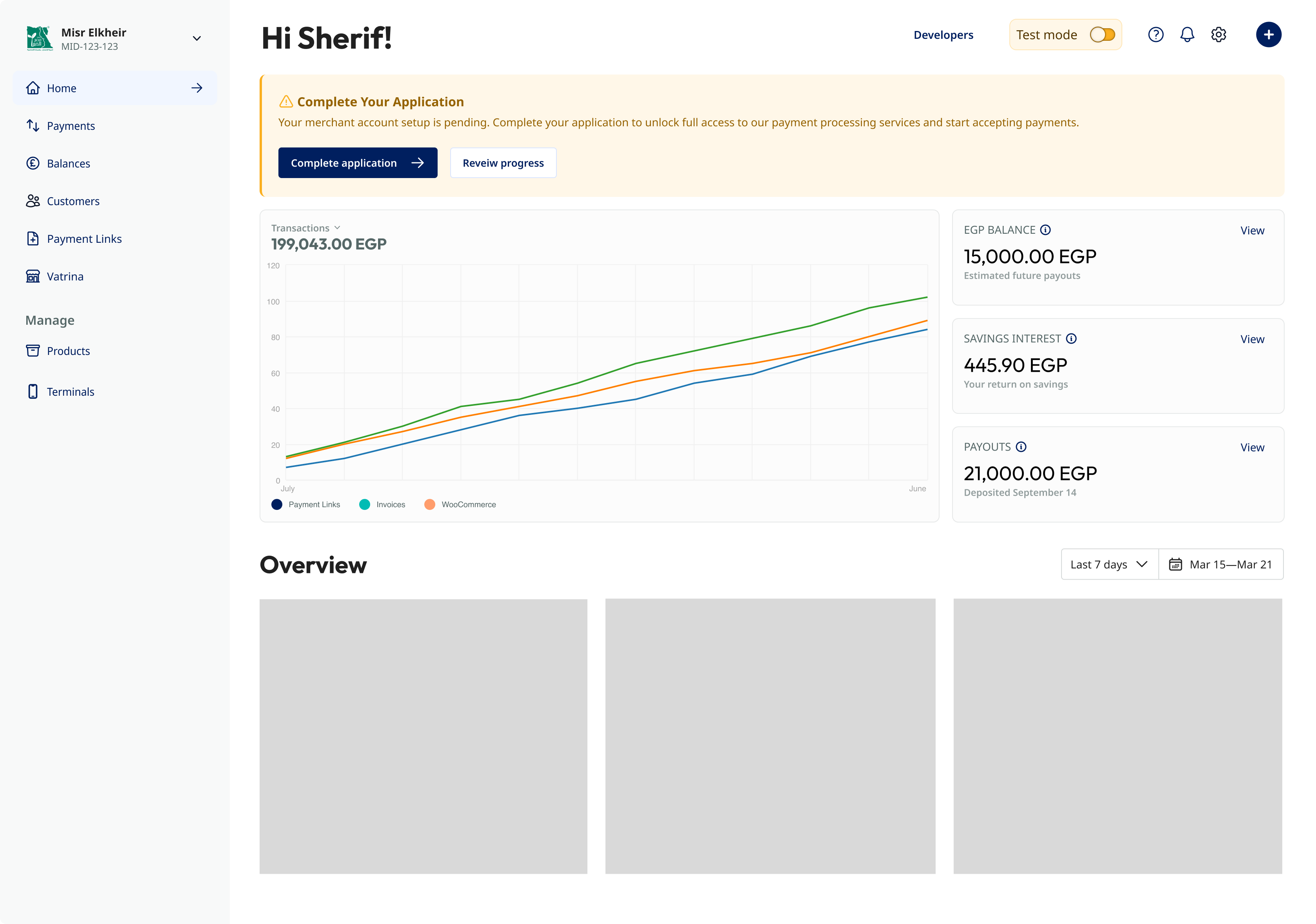
The first variant carried the alert metaphor into the new template. A single dismissible banner prompted account activation, sitting above the dashboard's new KPI structure. The surrounding layout was clearly better, the KPI column was systematic, the navigation was grouped, but the onboarding prompt still relied on a user noticing and acting on a single piece of text.
Variant B, Card Approach
The second variant replaced the alert with three purpose-built onboarding cards:

- Verify your business details, the critical activation step, coloured navy to signal priority
- Integrate your apps with Kashier, connect payment channels and third-party platforms, in Kashier teal
- Need help to get started?, direct line to onboarding support, in orange
Colour distinguishes urgency and category without relying on text labels alone. The zone is conditional, it disappears entirely once a merchant activates their account. An activated merchant never sees it.
The Two Variants Side by Side
Design Principles
Cards are more actionable than banners. A banner asks you to notice something. A card asks you to do something. Each card in Variant B has a clear headline, a clear destination, and visual weight that is hard to overlook, the kind of presence an alert banner can never achieve.
Conditional UI keeps activated dashboards clean. The onboarding zone is a state, not a permanent fixture. Removing it for activated merchants means the template serves both audiences without compromise.
Systematic components compound over time. The KPI card pattern and the navigation grouping are designed to scale. New items slot in without breaking what already exists, the layout problem that persisted through Phase 1 and Phase 2 is structural, not cosmetic.
Outcome
Variant B's card approach addresses the onboarding gap that Phase 1 and Phase 2 both left unresolved: three purpose-built cards, each independently actionable and mapped to a distinct activation step, ask a merchant to do something rather than just notice something, the limitation Variant A's alert still carried into the new template. Because the onboarding zone is conditional, it disappears entirely once a merchant activates their account, so the same template can serve new and established merchants without compromise. And because the KPI column and navigation grouping were built as systematic, scalable patterns rather than one-off layouts, the template has room to absorb new product surface, the structural gap that limited both earlier versions.